Greetings!
@pw - The knights look great, I like the contrast and limited use of colours.
@m4jumbo - Thanks! I was not sure about that banner, I will definitely try to improve it when I paint another infantry unit.
@pugwash - I like the spears. Especially when lined up in a 4-unit brigade in your gallery. I agree though, that two blue standards could be exchanged for one blue and any other colour of your choice. Just for some variety.
@jchaos79 - The idea of 4 horsemen and Death as characters for you army is brilliant!
Ok, I read your advice on taking photos and tried to implement the following:
1. Daylight - I definitely like it much better. However, too much sun is not good either, as it led to overexposure.
2. No zoom - I simply put my camera on tripod slightly closer. Side effect is that I can tak photo from another angle, showing a little bit more than just the front row.
3. More pictures with different settings - It does not take that long and really helps to pick the better picture, as there is plenty to compare to.
In general I think that the quality improved but I will try to experiment with different backgrounds as soon as I get the nice colours. All the things I have are greyish.
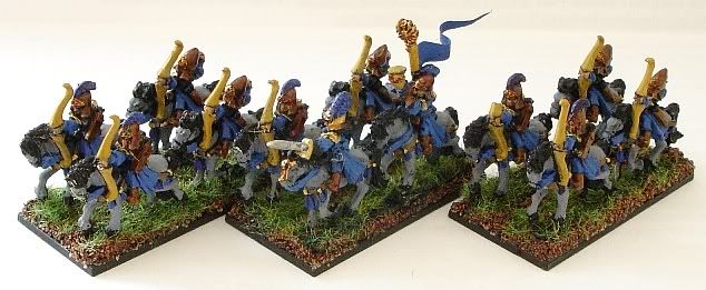
As to the week three entrance I have some reavers to present. It was an interesting experiment as they do not have much armour so I didn't know how they would fit in the overall theme. They proved to be easier to paint than I thought, especially with the fewer number of colours I used in the end. I also decided to paint horses in the same way for particular unit (as I plan to have 4 of them) for easy way to distinguish them on the table. As I mentioned before, it is my first unit of reavers ever.
